SEC. 02 The full presentation

Case study · 03 / 06
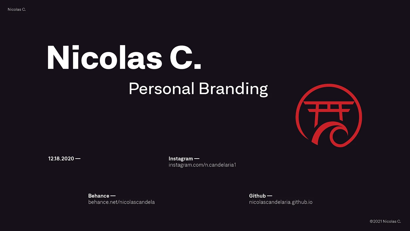
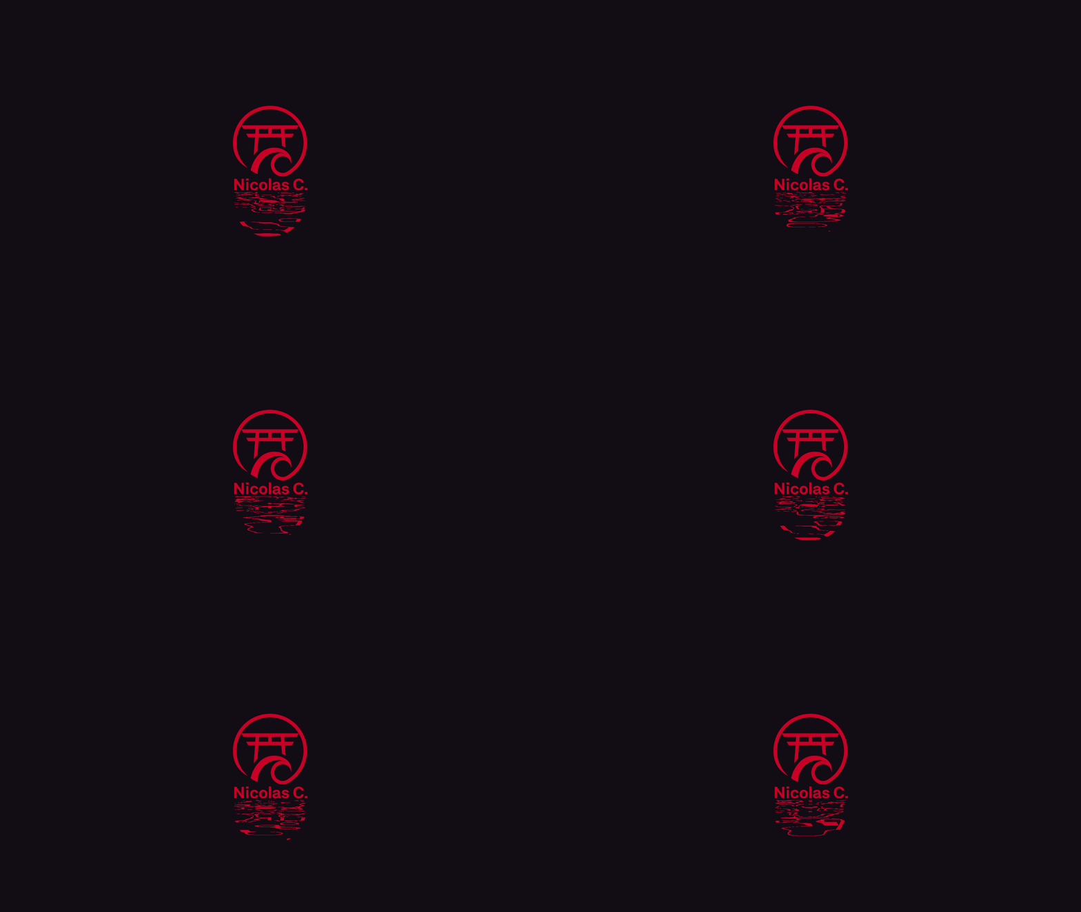
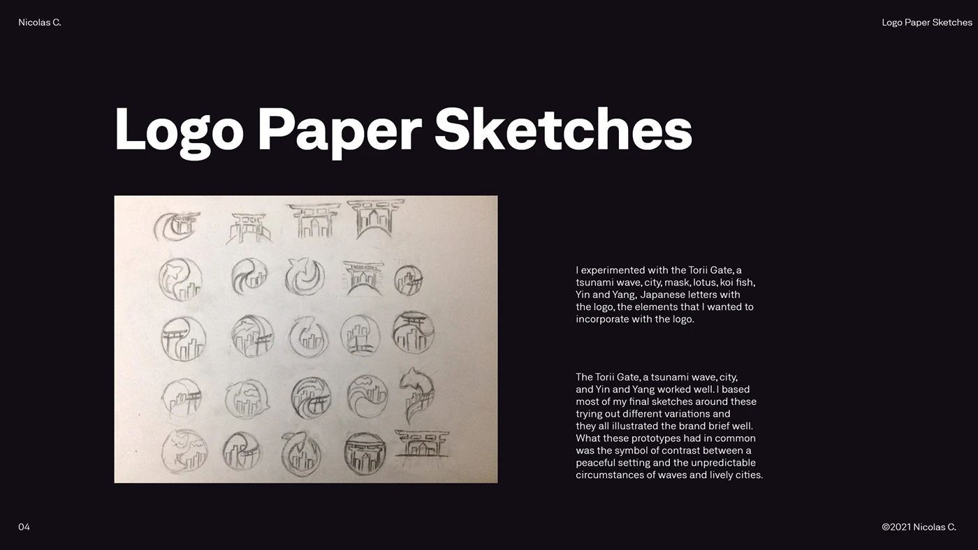
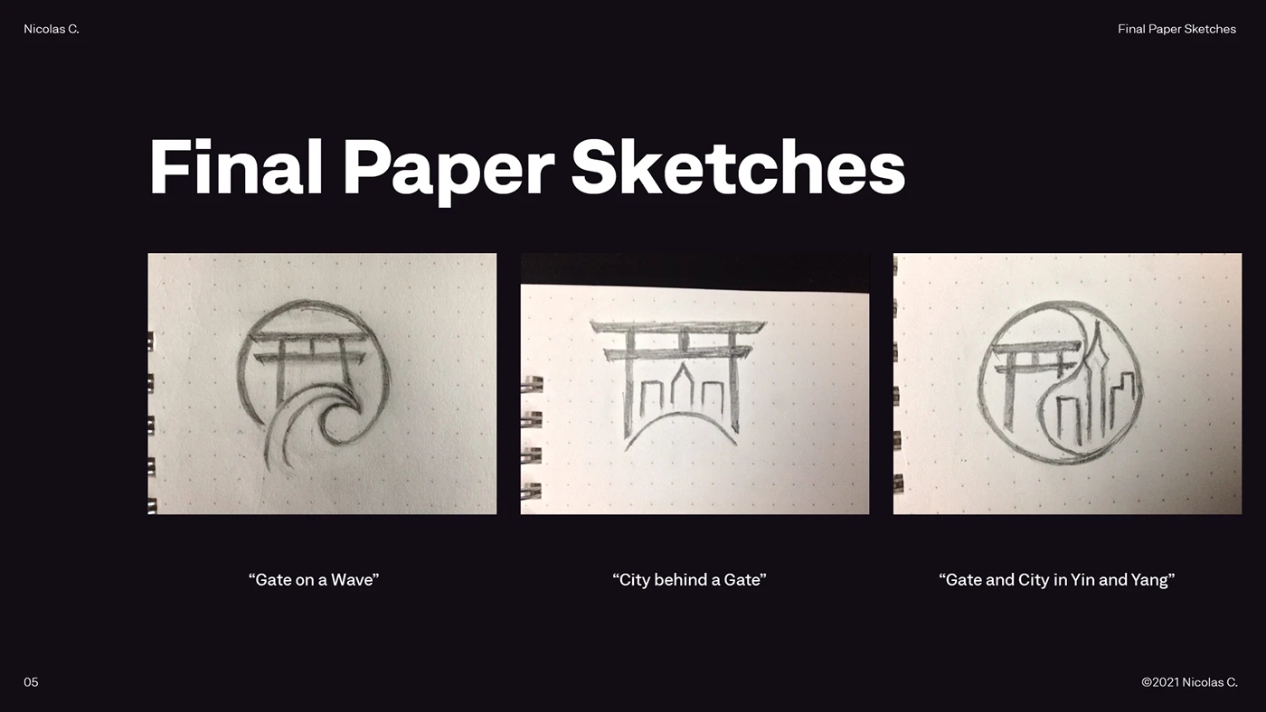
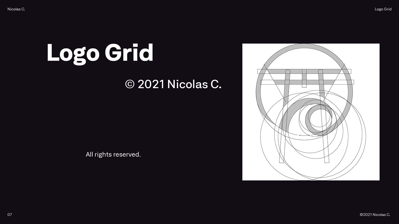
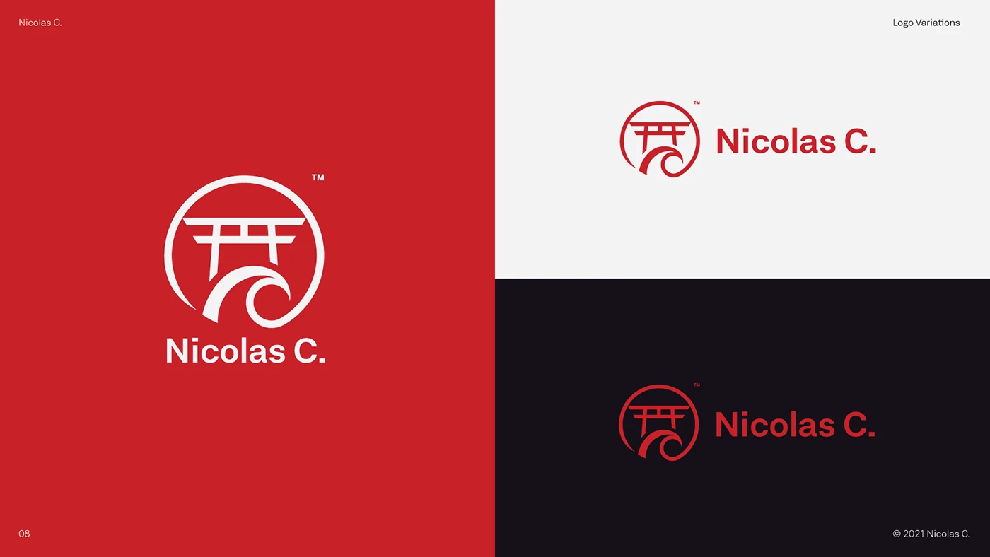
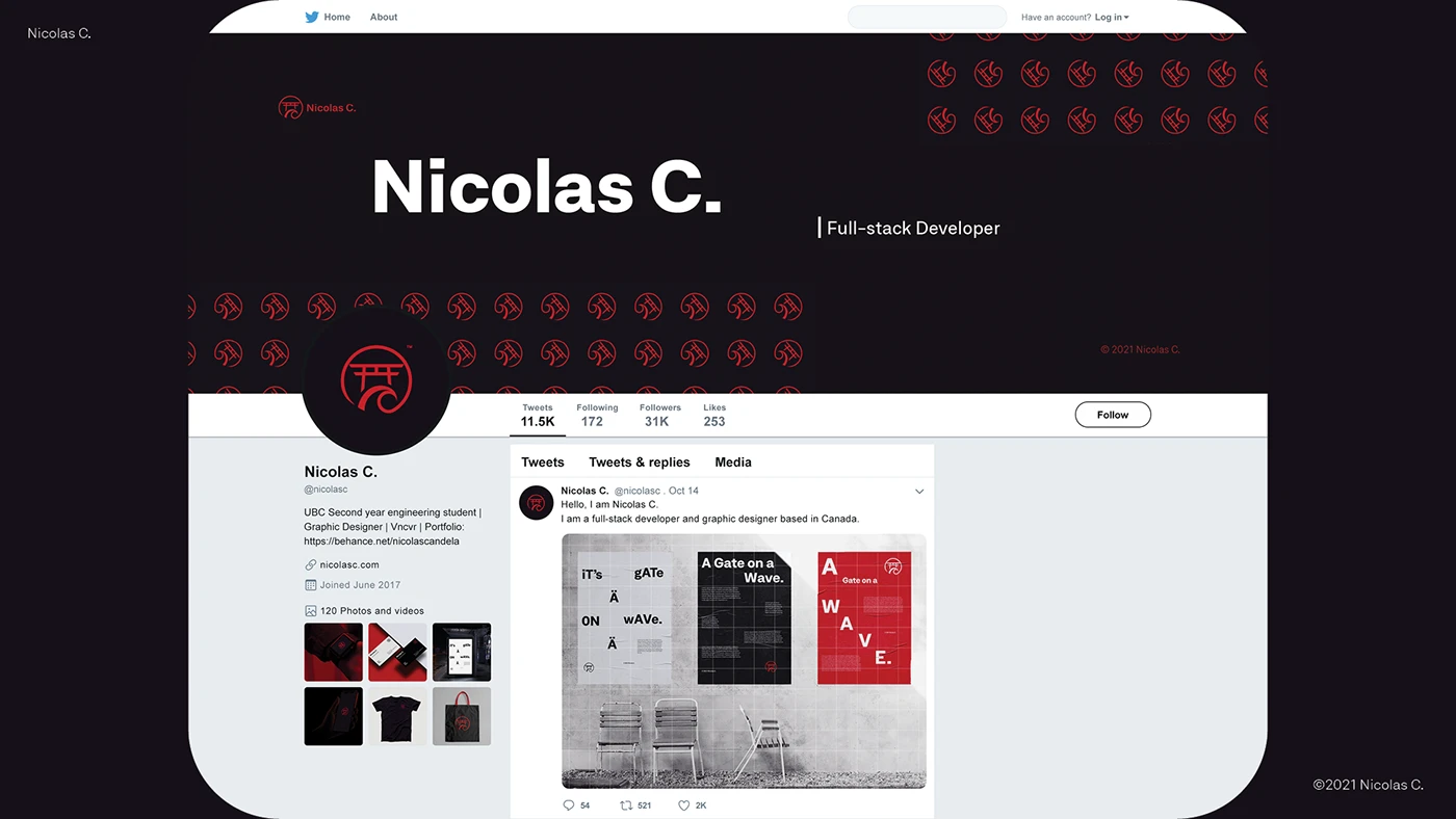
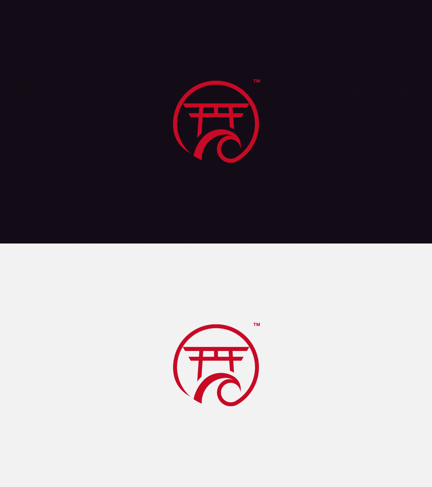
An introspective exercise on my values as a designer. The mark, a torii gate riding a wave, had to go far beyond aesthetics and say something true about how I work.
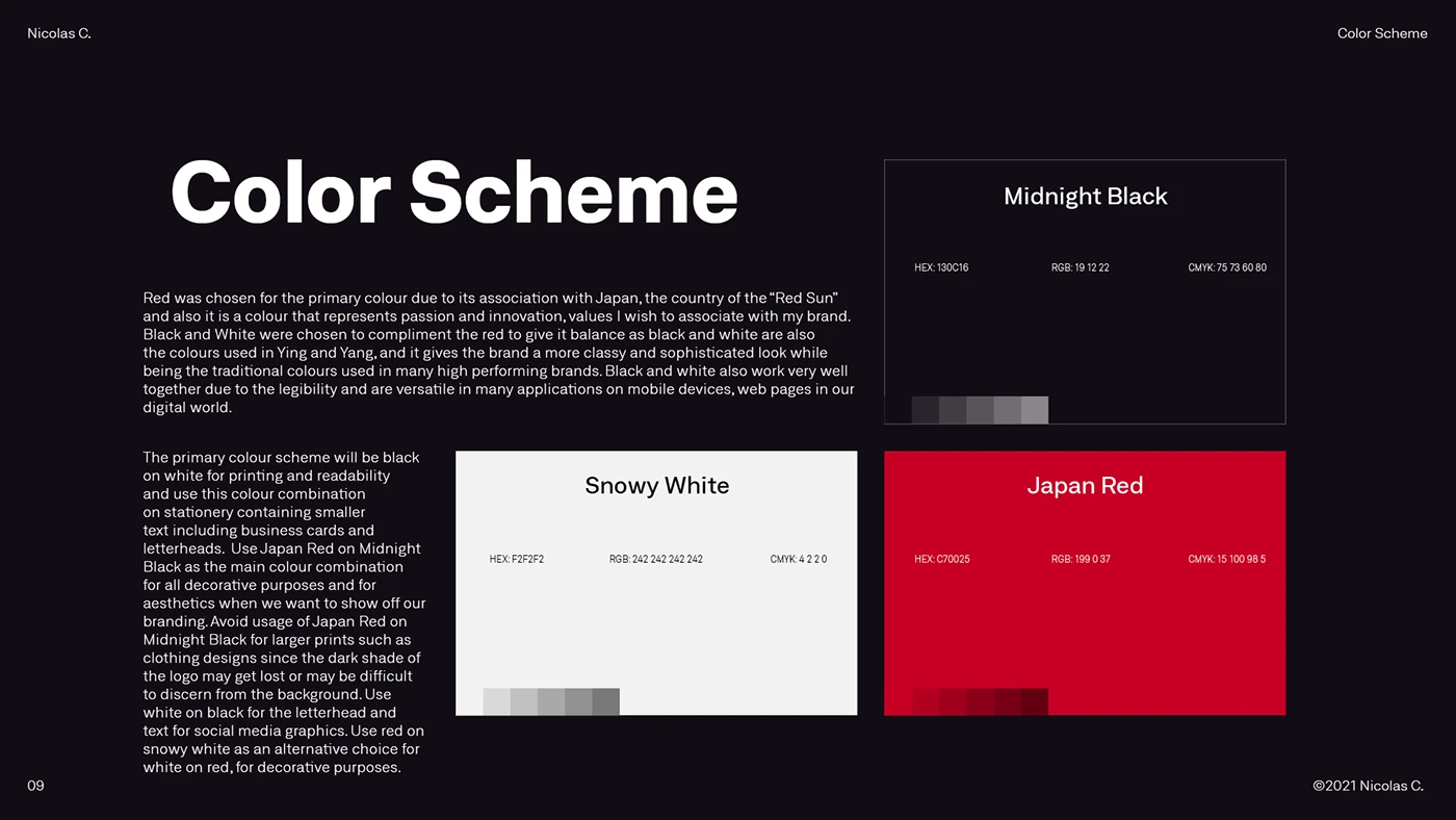
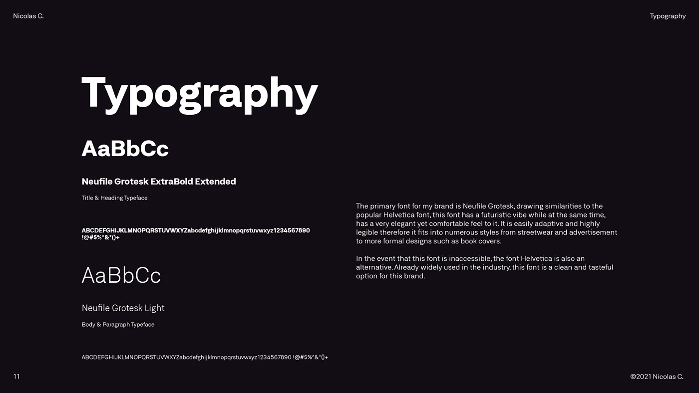
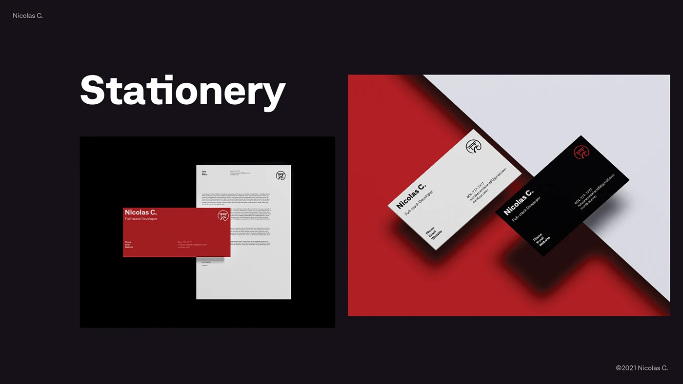
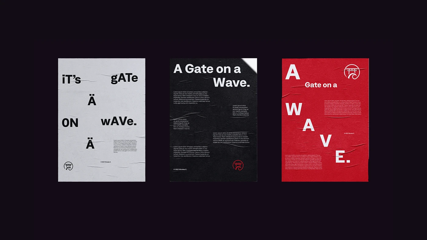
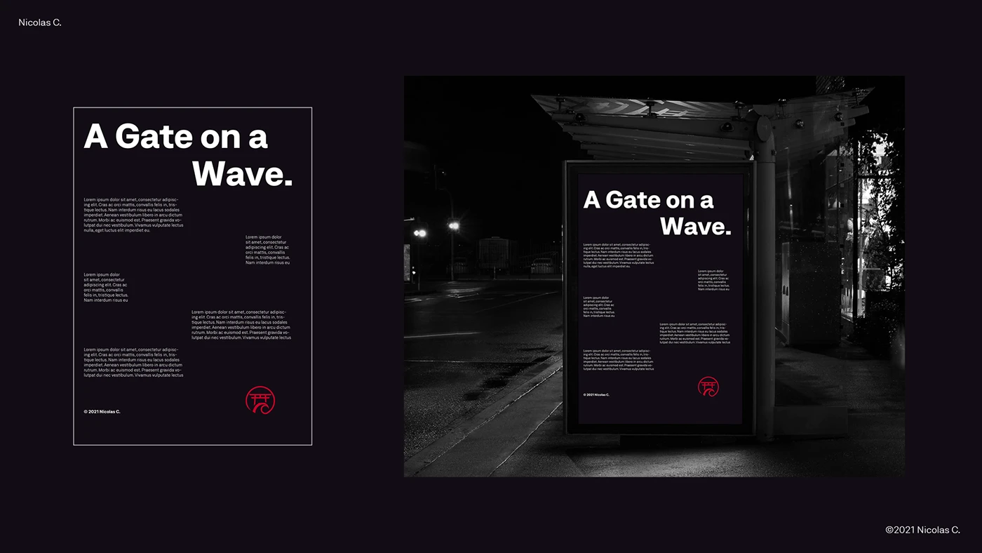
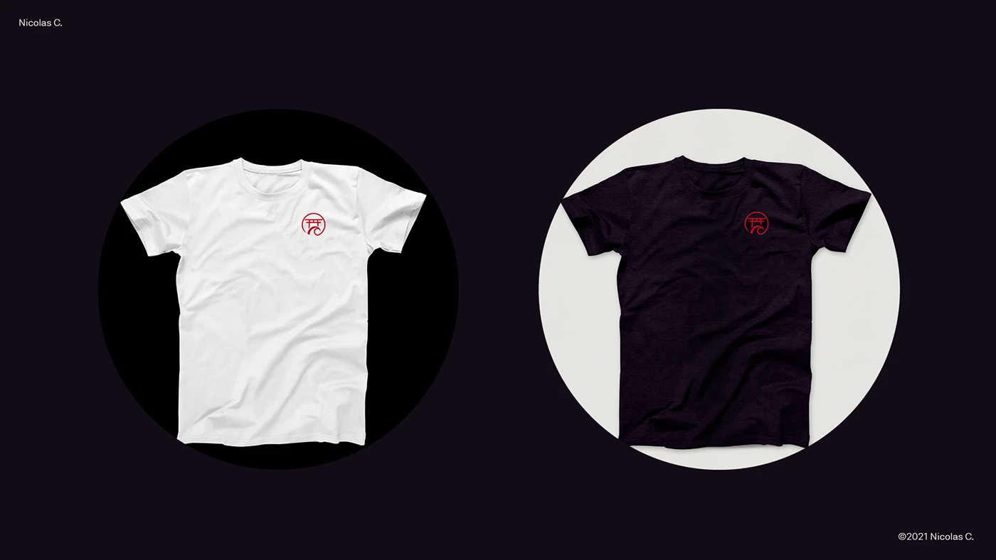
The goal was a modern but timeless identity representing me and my values, with every element deliberately curated: mockups, typography, and colour.
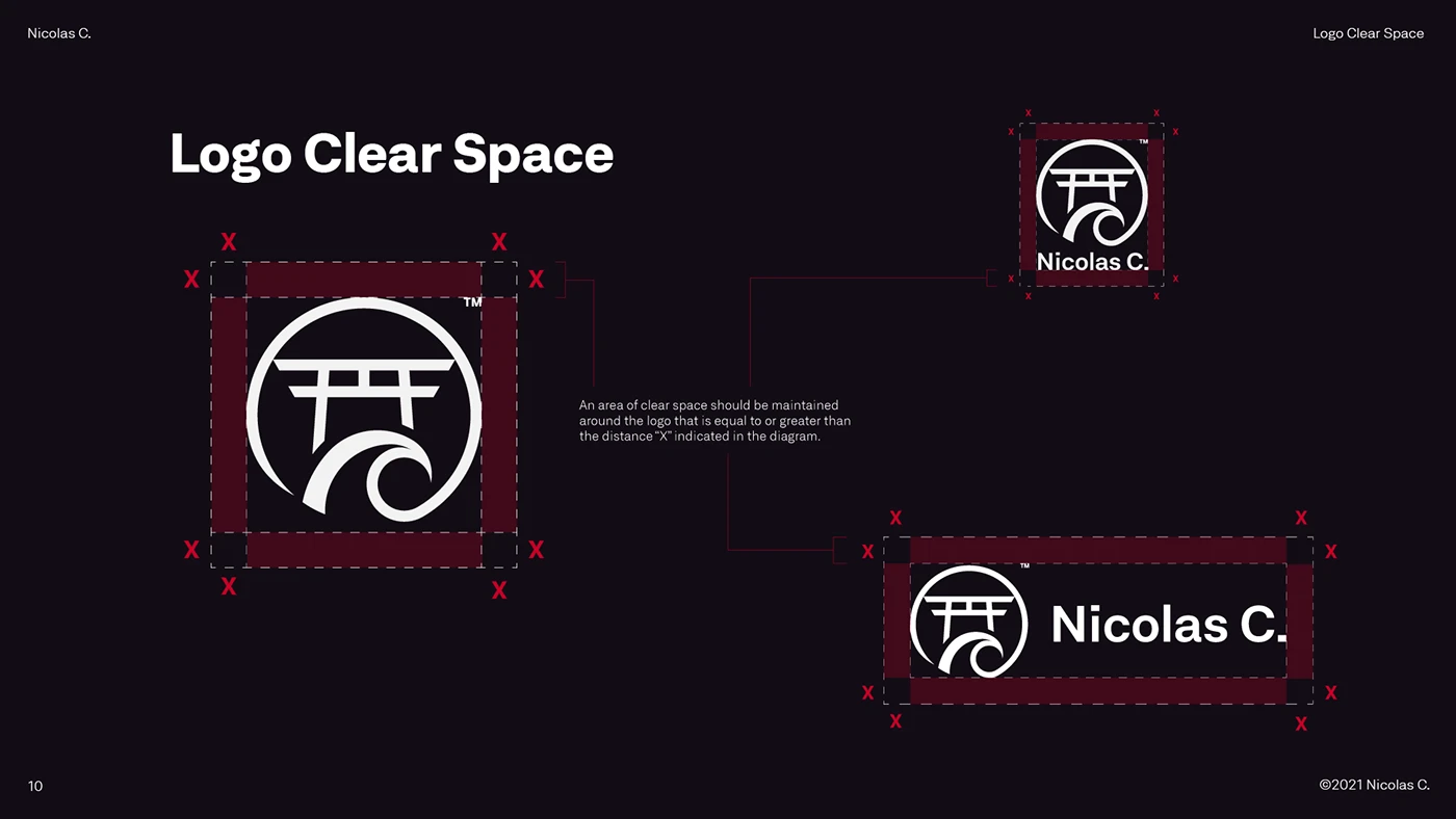
The logo stands as proof of navigating conflicting values and fusing them into something meaningful: a philosophy condensed into a symbol rather than just a visual element. It now runs everything you're looking at: the mark, the type system, the palette, and the code behind it. Of everything I've made, this piece carries the most pride.